Three well-known companies – Xerox, Starbucks, and the Gap – have recently made changes to their most public face, their logos. Each change has met with varying degrees of success, giving media educators an opportunity to look at just what makes a successful logo work.
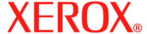
In this age of constantly changing corporate names and logos, Xerox has long been an exception: up until now its logo has been essentially the same as the one it adopted in 1961, except for a change from blue to red in 1994. But the company found that what was once a strength is now a weakness: the brand awareness that made “Xerox” a synonym for “photocopy” is keeping public perception of the company stuck in the past. Today's Xerox wants people to know that it is about more than copying – that it is, increasingly, selling services as much as products.
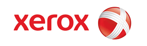
The new logo, which Xerox is rolling out in a “multimillion-dollar campaign,” also aims to increase Xerox's visibility in sponsored events and in interactive media, where the company hopes to increase its presence. Xerox chief Anne Mulcahy hopes the logo will help change the perception of the brand to “engaging and approachable …technologically savvy and eager to lead in the 21st century.”
With that in mind, Xerox is moving from upper-case letters to ‘friendlier' lower-case, changing to a deeper shade of red and using a typeface the company owns (to discourage copycats.) They also added a graphic logo, a red ball which can be animated and bears a distorted version of the famous “X.”
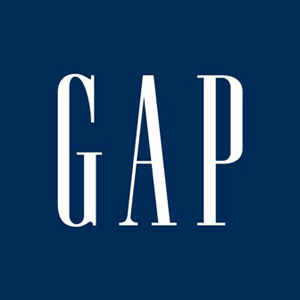
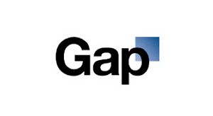
Clothes retailer Gap made a similar change, abandoning its highly-recognizable logo for one with a very different feeling. In fact, the two Gap logos are more different than the two Xerox logos in one important way: a change from a serif font (the “nubs” on the letters on the old logo) to one without (“sans serif,” in design lingo.) The decision of whether to use a serif has two dimensions, one practical and one more aesthetic and emotional. From a practical perspective, sans serif fonts are somewhat easier to read, particularly on a computer screen (Microsoft Windows has traditionally been bad at displaying serif fonts, though this has become less true). Aesthetically, sans serif fonts were strongly favoured by Modernist designers (due to their association with stencils and commercial art, both important influences on the Modernists) and – despite the time that has since passed – still communicate a clean, modern, streamlined feeling, while serif fonts are seen as more formal and stuffy. The combination of the practical and aesthetic values of sans-serif fonts have made them the overwhelming favourite of Web page designers, which may have been what prompted Gap to abandon their old serif logo. As Gap president Marka Hansen put it, “We chose this design as it's more contemporary and current. It honors our heritage through the blue box while still taking it forward.”
Unfortunately, response to the new logo – mostly expressed on Facebook and Twitter – was overwhelmingly negative. This may have been because the new logo, while certainly sleeker than the old, was painfully generic; it may also have been because the old logo, unfashionable though it may have been, was more in tune with consumers' associations with the brand. Gap, after all, is not generally a place where hipsters shop: its most iconic product is khakis, associated in its most famous ad campaign with figures such as Jack Kerouc and Steve McQueen. In the end Gap retired the new logo after just one week and, after a brief attempt at “crowdsourcing” a new design, reverted to the old one. What this shows is that it's not just important to have a good logo (though the new Gap logo wasn't particularly good), but that a logo has to communicate the same associations as the brand.
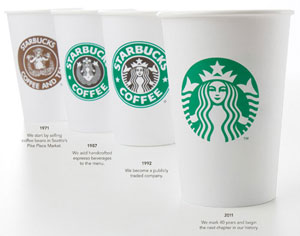
Most recently, Starbucks debuted a new logo that took branding to a new level by actually removing the company's name. This isn't the first time Starbucks has changed its logo – most famously, it made the iconic mermaid safe for family viewing by covering her breasts, in time-honoured fashion, with long hair – but it is the first time that the logo has not included either the words “Starbucks” or “coffee.” In doing this they join brands such as Apple and Nike, both of which are now represented only by iconic images. The question is, is the Starbucks mermaid iconic enough to stand on its own? Starbucks representatives have hinted that the move is part of a desire to broaden the brand beyond coffee, but it may backfire: recent research has shown that while changes in a logo have no positive or negative effects on those who don't already have an attachment to the brand, those who already have a longstanding loyalty will almost always respond negatively. The moral of all these stories may be that when it comes to logos, you shouldn't try to fix what isn't broken.
For Class Discussion
Ask students:
- Why did the three companies profiled want to change their logos? Do you think it was a good or a bad decision? Why?
- Consider the changes made to the Xerox and Starbucks logos. Do you think they will have the effects the company is hoping for?
- Think of some well-known, recognizable logos. What does each logo say about the brand it represents?
Activity
- Have students choose an institution or organization whose logo they think needs updating. Why is its old logo no longer appropriate? How can the logo be updated to communicate the image the brand wants?
Links
You can see the evolution of the Xerox logo at Xerox's Web site.